Quest
Money-saving app
Concept app design
Jump to:

OVERVIEW
Role:
UI Designer
Context:
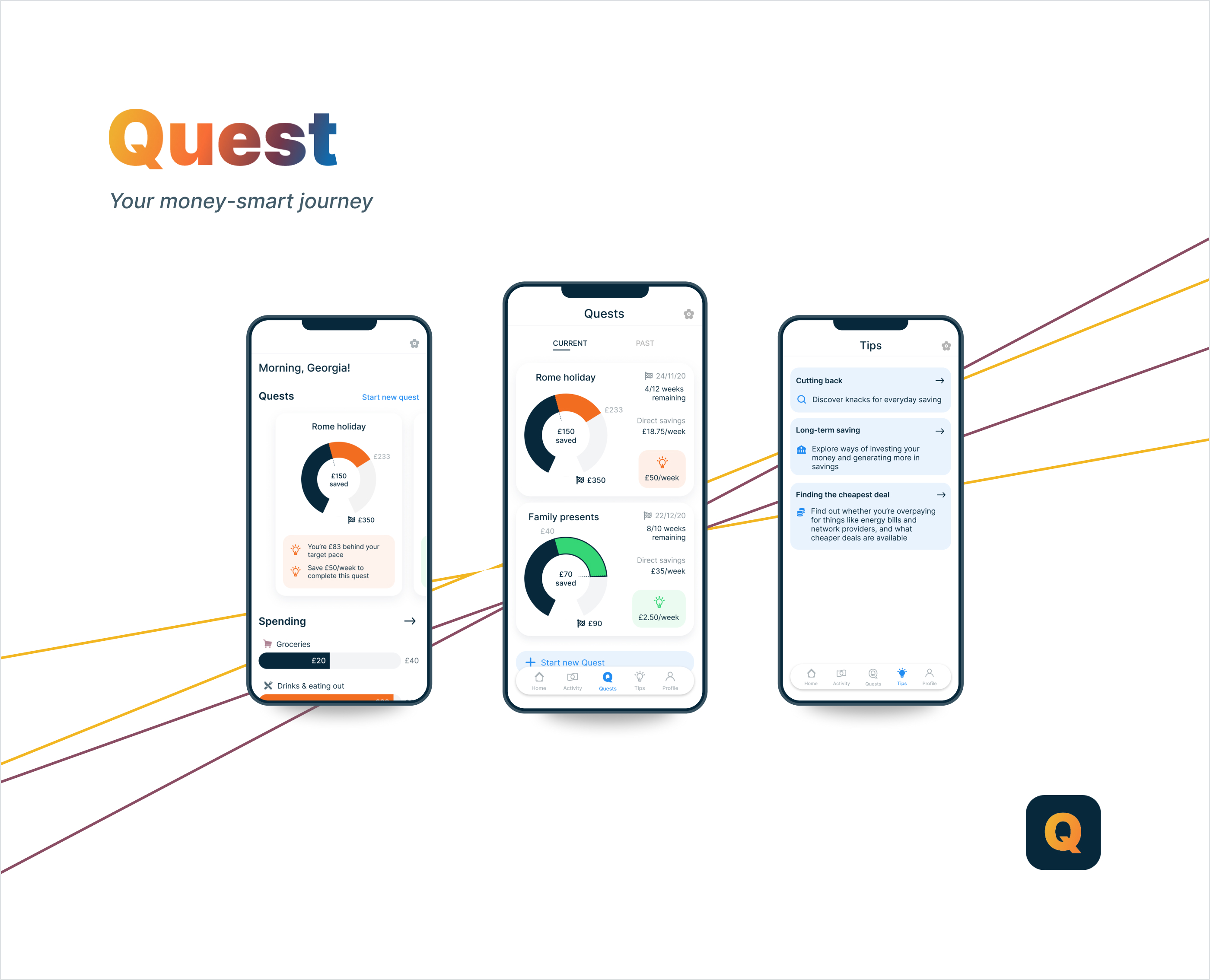
Quest is a concept fintech app that I designed on my CareerFoundry UI course.
Tools & resources:
Figma, Useberry
OBJECTIVE
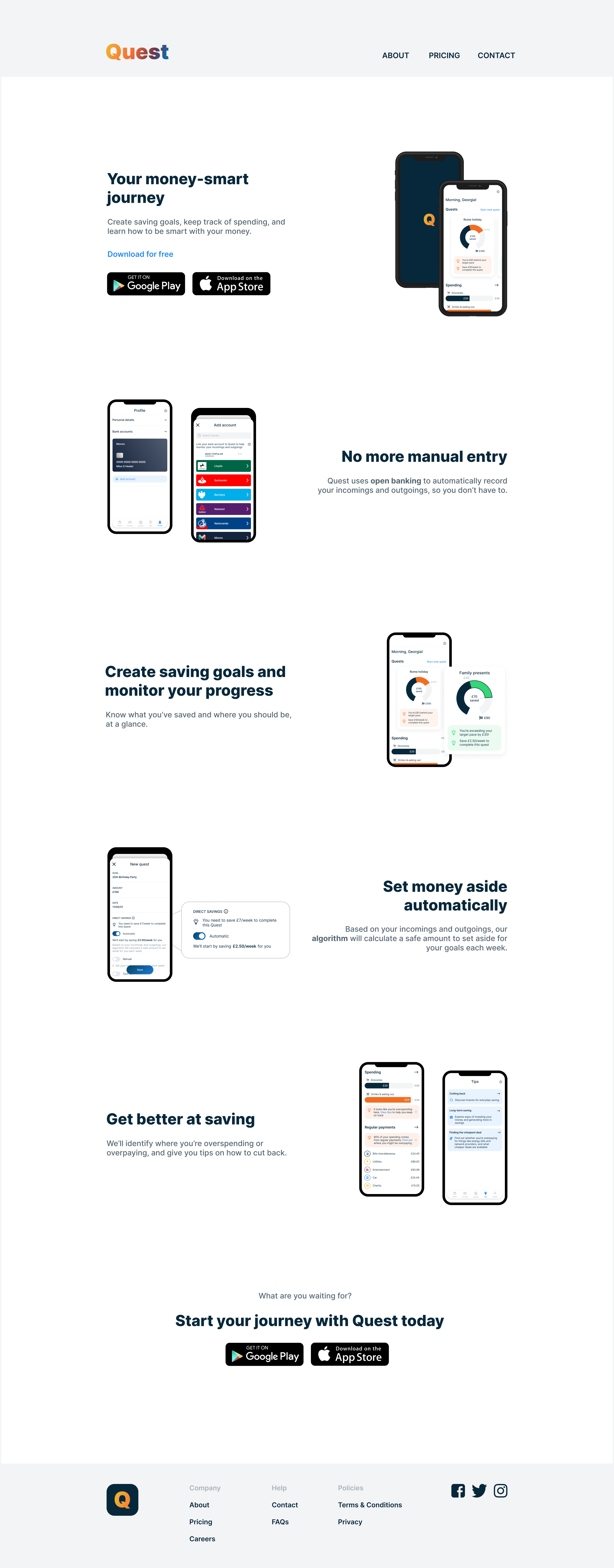
The brief was to design an app that helps people to save money quickly in preparation for a big purchase or expenditure. Quest allows users to create savings goals, keep track of progress, and empowers users to act if they fall behind.
How can we help empower users to save money quickly in preparation for a big purchase?
The 5 Ws
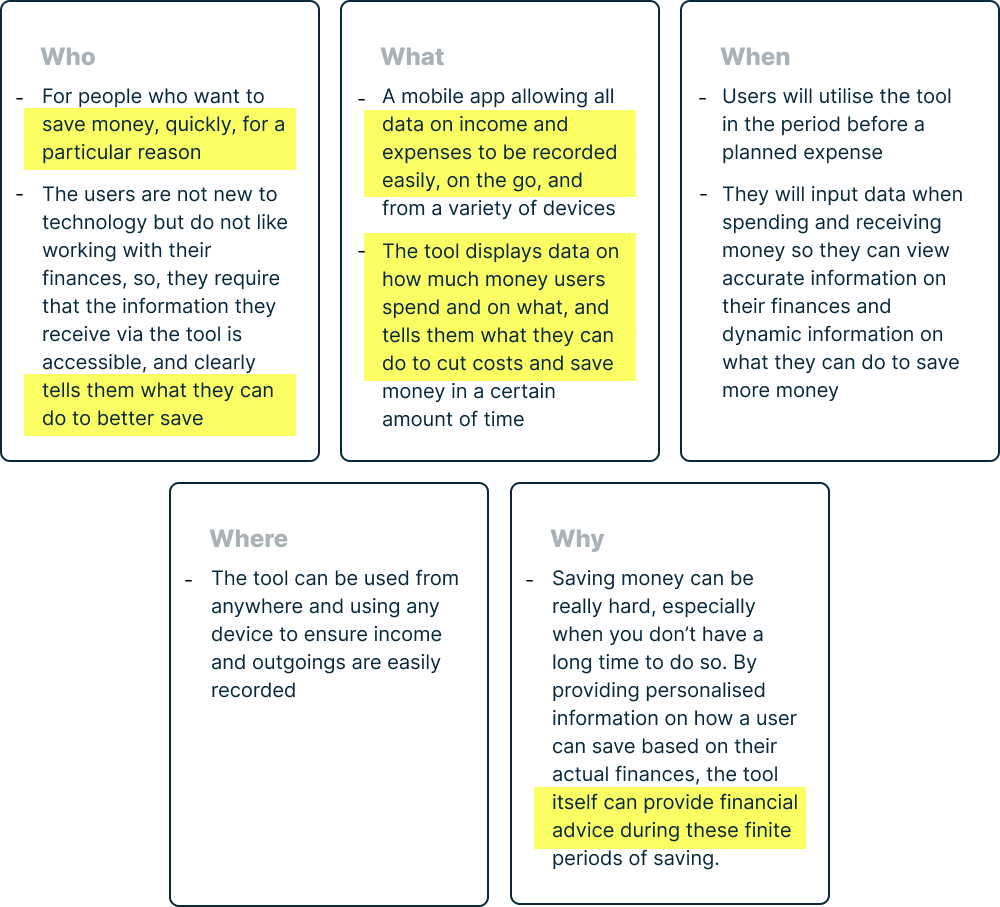
Noting the 5 Ws helped to ensure my designs remained user-centred throughout the design process:
CHALLENGES
Complexity
Designing for complex tasks and displaying data-heavy visuals could potentially result in a cluttered and confusing interface. My goal was to keep the interface as clean and simple as possible, to ensure users would not be distracted from completing their money-saving goals.
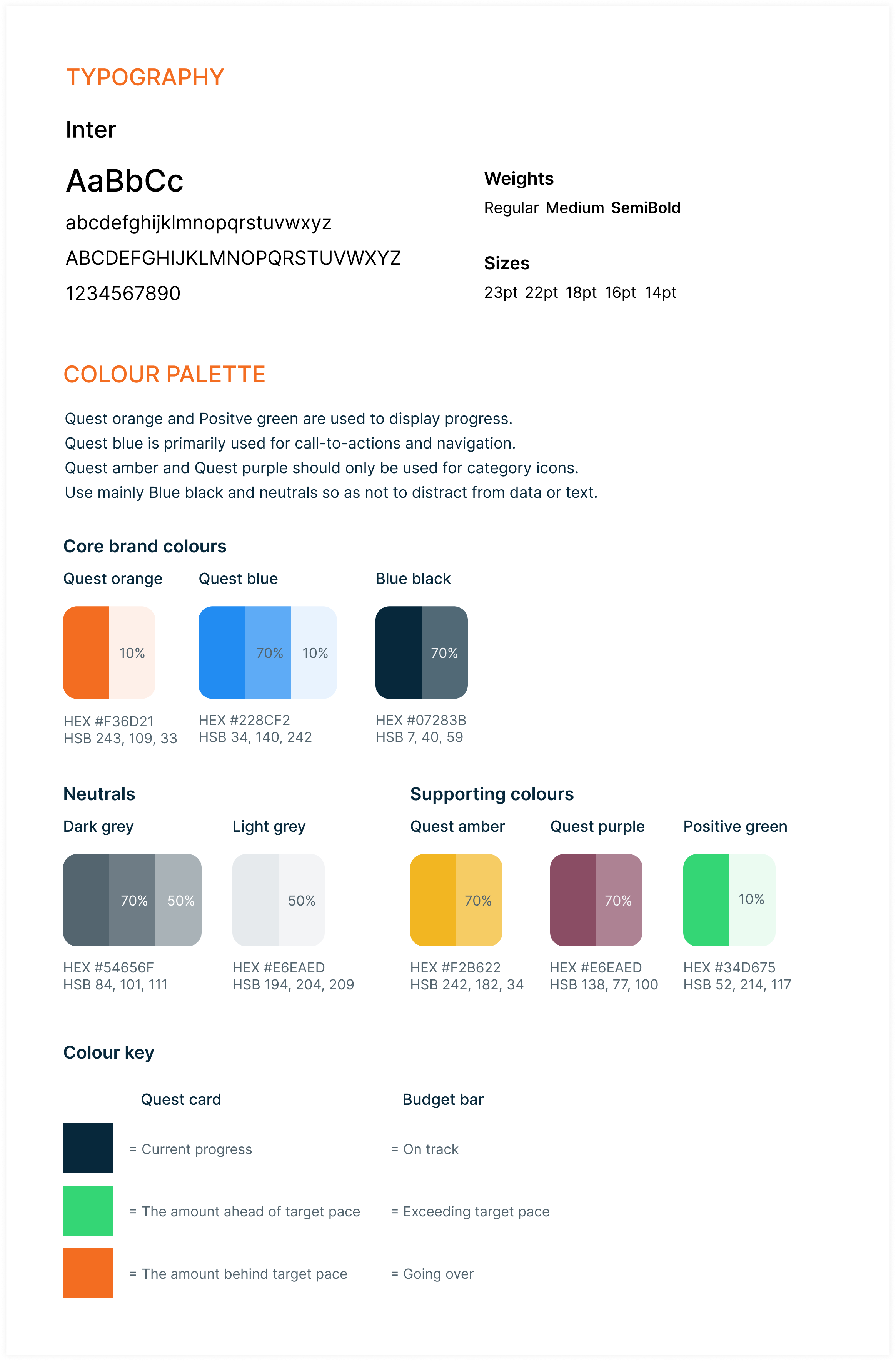
Use a varied colour palette but apply sparingingly to assist with data interpretation.
Advanced features
In order to reduce the effort of tasks (‘user will input data when spending and receiving money’) and make the app as helpful as possible (‘tells them what they can do to cut costs and save money’), I needed to provide more advanced solutions.
Use open-banking API, so income and expenses are recorded automatically, and have an algorithm that calculates how much users need to save each week to reach their goals.

USER FLOWS
USER STORIES
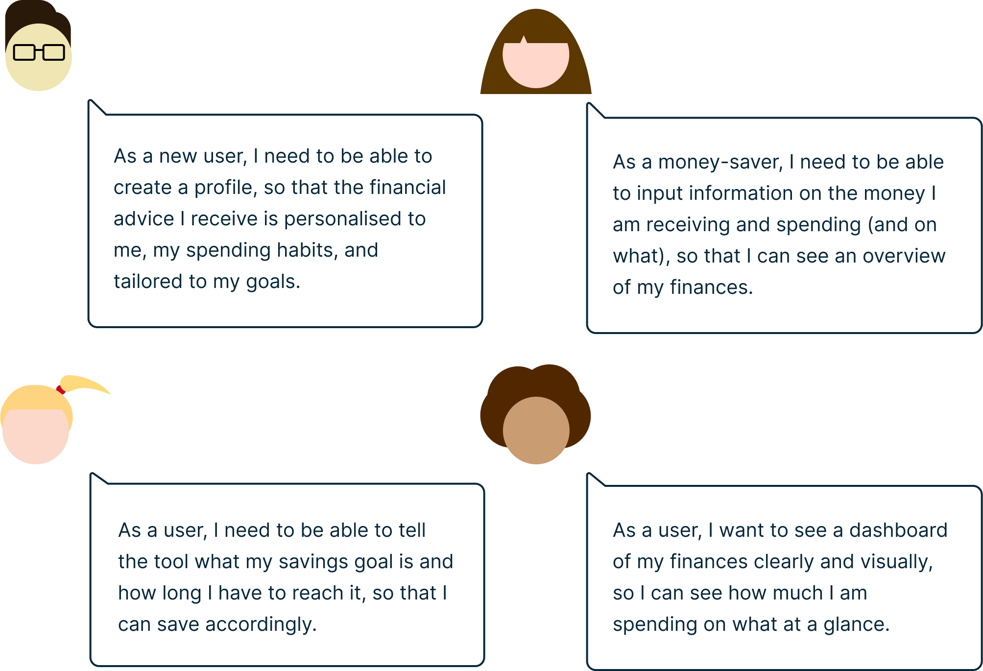
The brief provided four user stories from which I was to design my money-saving tool from:
USER FLOW DIAGRAM
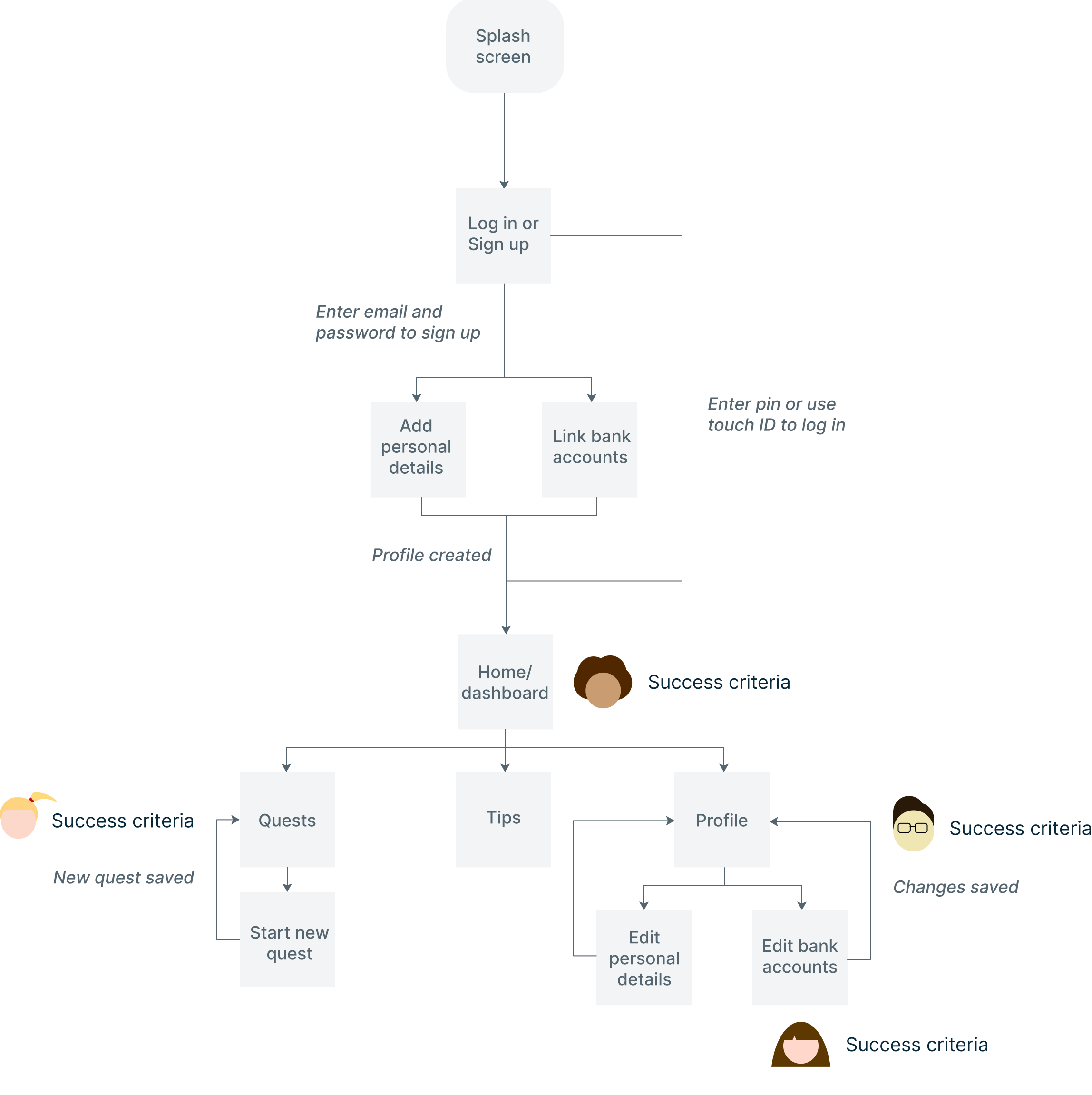
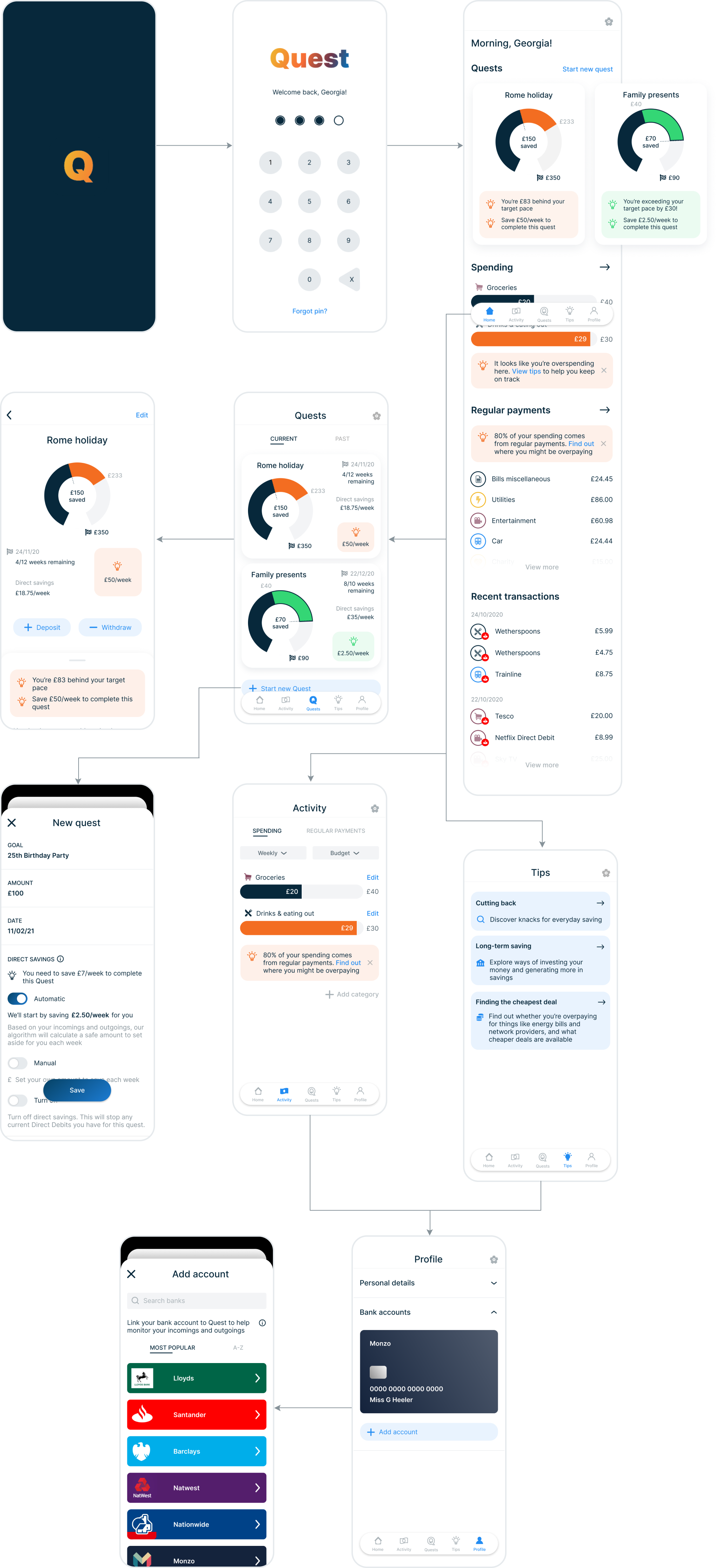
From the user stories I was able to define the corresponding Jobs to Be Done (JTBD) and feature requirements, enabling me to map out the user flow diagram more easily. See breakdown of JTBD and feature requirements here.
WIREFRAMiING
LOW FIDELITY
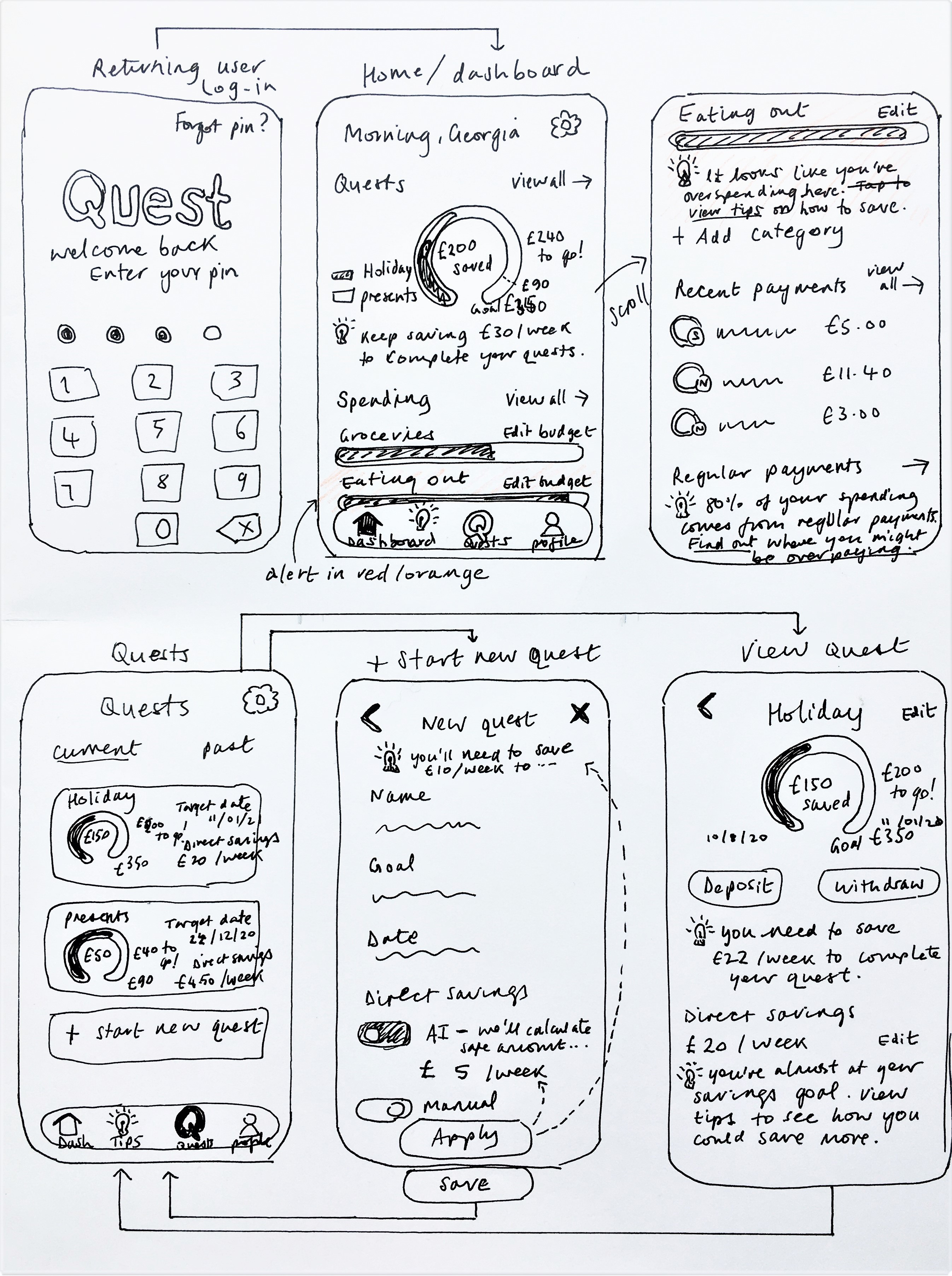
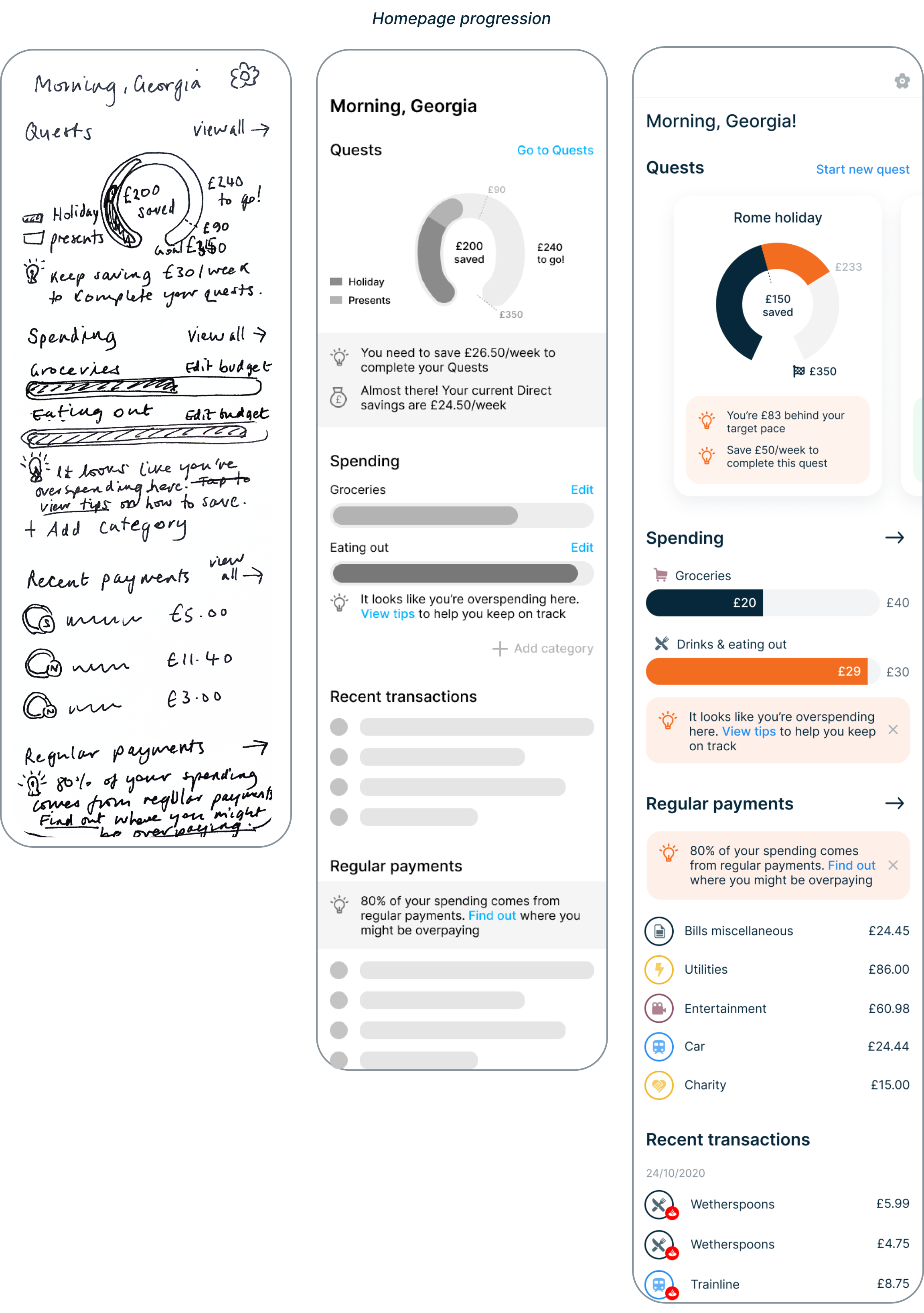
It was time to start sketching out the general layout, placement of elements, and appearance of my screens before opening up Figma. This phase allowed me to quickly try out ideas before committing to any designs.
MID-FIDELITY

USABILITY TESTING
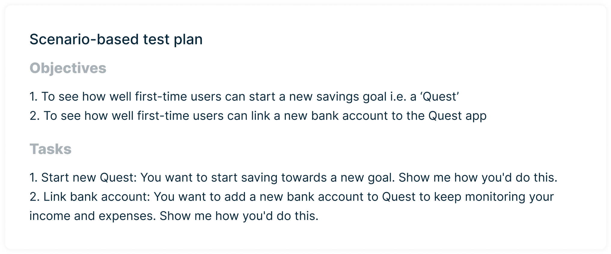
I now needed to validate my designs by testing them with potential users, to see how well they could navigate the app and complete primary tasks. I conducted five testing sessions; four were moderated either in-person or via Skype, and one was unmoderated and self-recorded via Screencast-o-matic. All participants were asked to complete two scenerio-based tasks via Useberry.
See full testing schedule and results synthesis here.
RESULTS AND FEEDBACK
Overall, the prototype was well-received and all five participants successfully completed both tasks.
Positives
The most common positive feedback centred around the advanced features and the interface being user-friendly.
“I like that you have an overview of all your regular payments - you can clearly see every month you’re spending £10 on Netflix”
“It’s simple, which is really nice and easy to understand”
“The tips regarding overspending is my favourite feature, that’s very useful”
Problems
Despite a lot of encouraging feedback, there were quite a few problems that were either verbalised while ‘thinking aloud’, or implied from participants’ facial expressions and clicking behaviour.
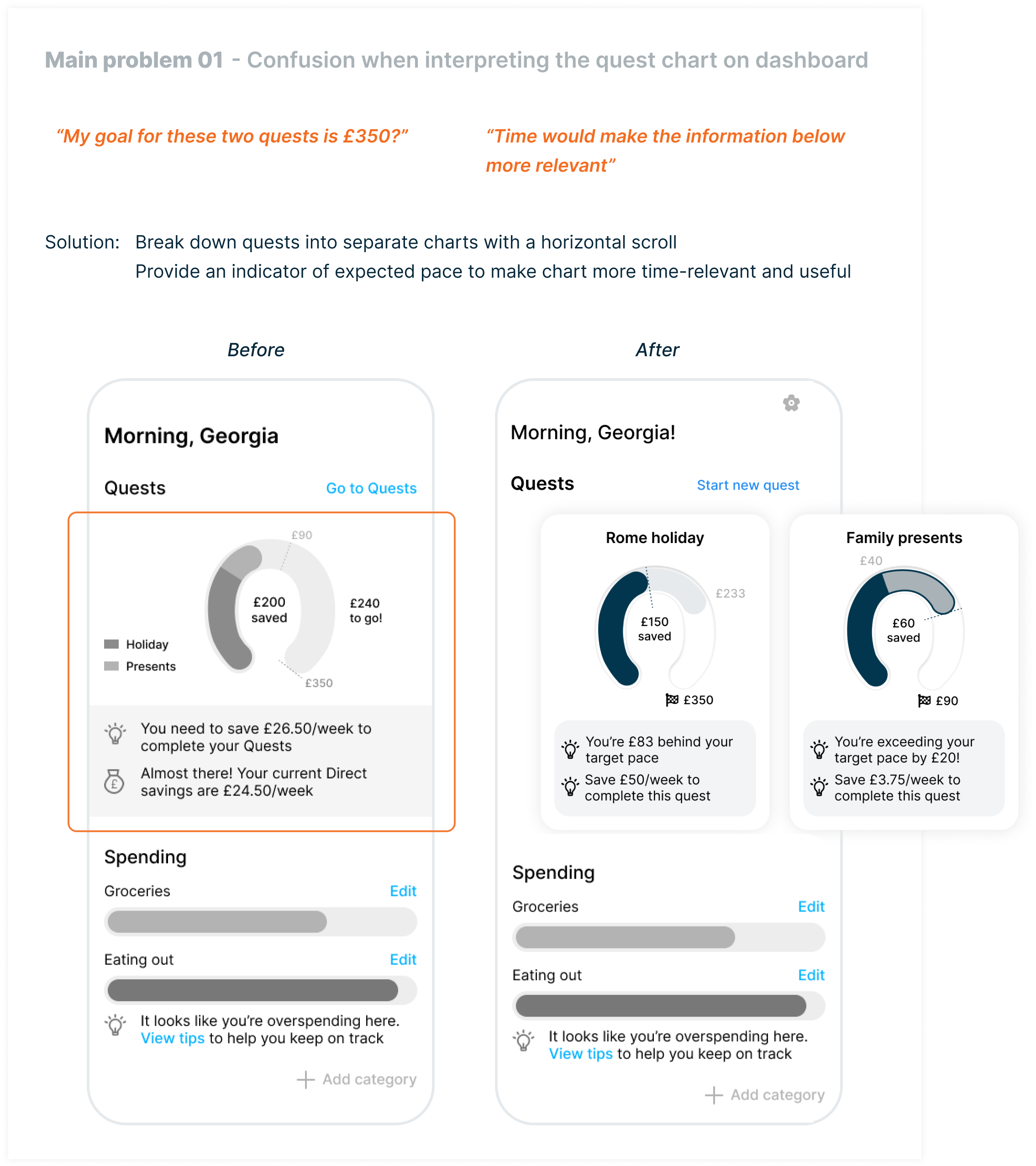
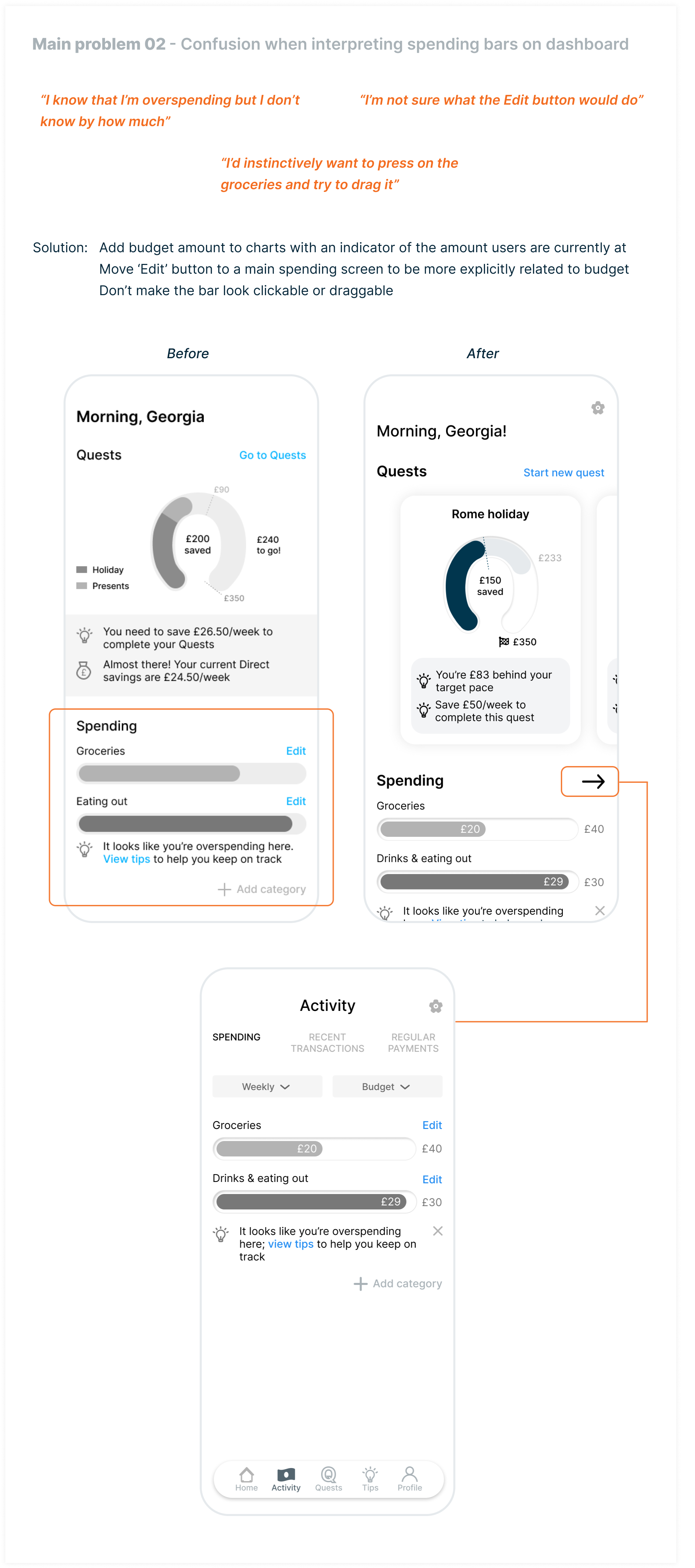
I rated the above and all remaining issues in line with Nielsen Norman Group’s usability problems rating scale and provided appropriate solutions accordingly.

BRANDING
LOGO DESIGN
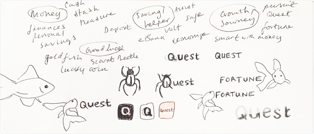
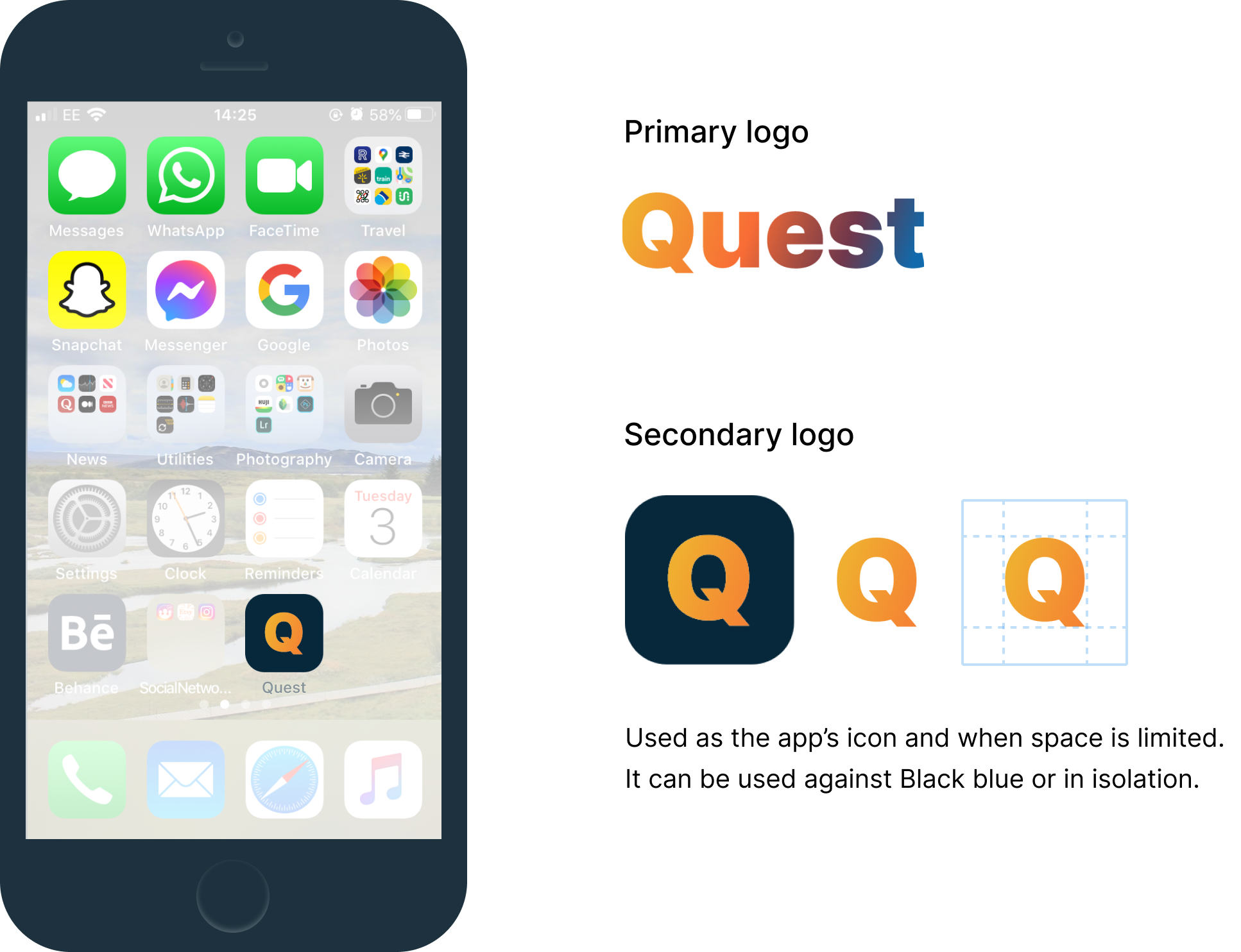
The name and logo were developed through jotting down words and imagery associated with money, saving, growth and good fortune. I chose ‘Quest’ as this best embodied the money-saving journey depicted by the brief.
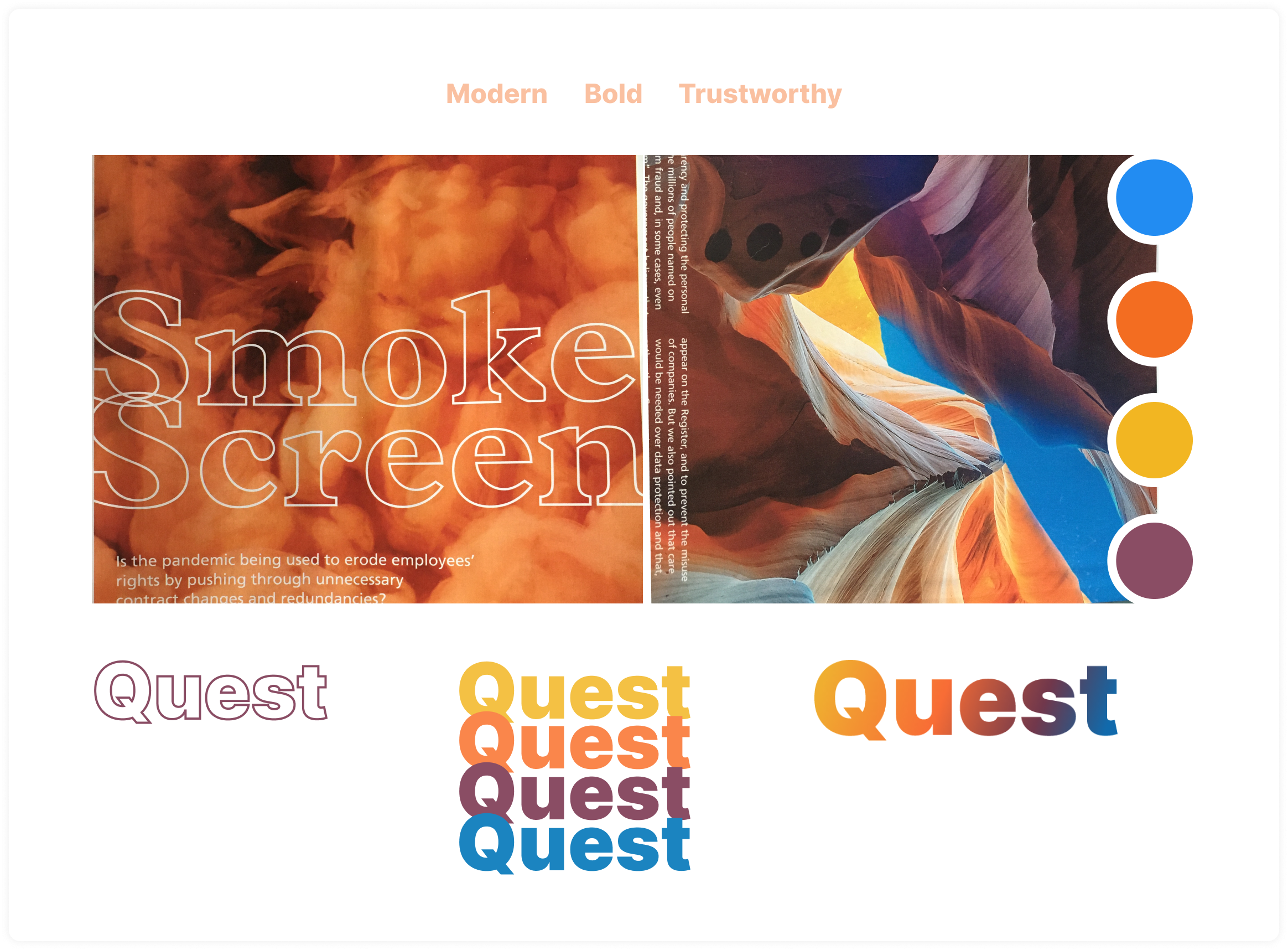
Orange was chosen to mirror the colour of goldfish, which is a symbol of good luck and prosperity. Orange is also associated with motivation and positivity, which reaffirmed its use in Quest.
Quest blue, in contrast, was selected owing to its embodiment of trust and professionalism. The colourful gradient used in the final design helps project a bold yet humble presence.
GUIDING PRINCIPLES
Mission
Our mission is to create a smooth-saving journey for all. We do this by helping our users to easily manage their money and by educating them on how to be money-smart. We believe education forms the basis of sustained money-smart behaviour that will continue outside of and beyond their use of Quest.
Vision
Knowing how to be smart with your money shouldn’t come at a cost. Our vision is to make saving easy and accessible for everyone.
Values
Transparent
Being honest and open at every step of the journey is integral to building trust with our users. Trust forms the foundation from which users rely on us to manage their financial information and to help them save. Our honesty also ensures users’ goals are realistic, so they remain motivated and can continue to rely on us throughout their journey.
Driven
We are determined to improve the lives of our users by helping them gain better control of their finances. We want our users to live worry-free by being able to afford the things they want and need in life.
UI DESIGN
STYLE GUIDE

FINAL SCREENS
REFLECTION
Learning new tools
I used this project as an opportunity to learn Figma and it was extremely beneficial. After attending Figma’s (virtual) Config Europe 2020 and watching a demo of their new updates, I was really impressed by how powerful the tool appeared to be and the scope of its prototype function. In terms of practicality, I particularly liked Figma’s document set-up since you can have multiple pages under a single document, whereas XD requires you to make multiple documents. Also, although not relevant to this project, the ease at which teams can collaborate on projects and see real-time changes makes it all the more appealing.
Less is more
I maintained my learnings from previous projects around ‘the simpler, the better’. This was particularly important given the interface’s data-heavy nature and the complex functionality and feature requirements. Using less colour and more spacing paid off with a simple, clean interface.