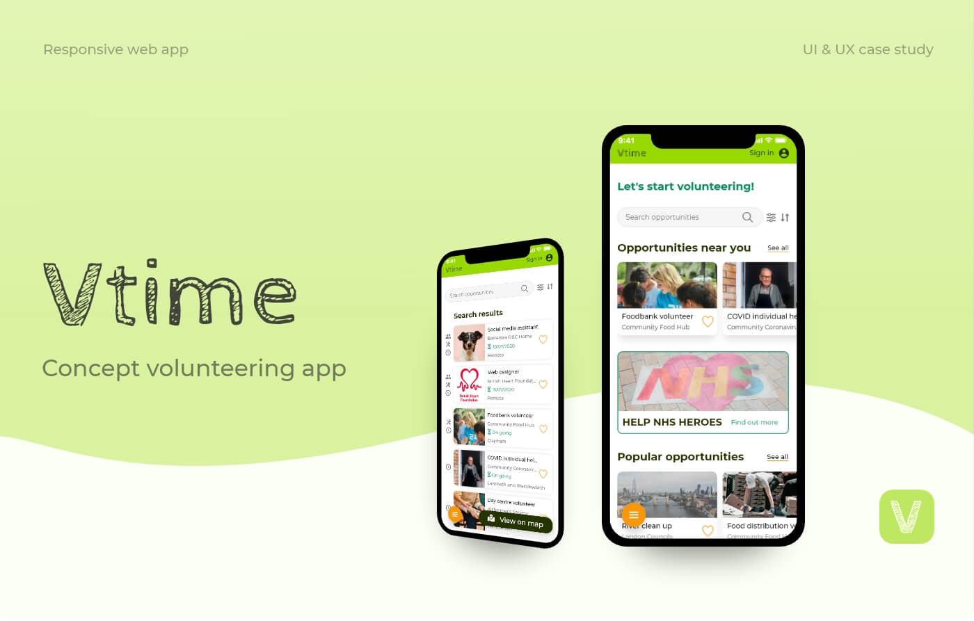
VTime
Volunteering app
Concept app design
Jump to:
OVERVIEW
Role:
UX & UI Designer
Context:
VTime was a project I designed as part of my Career Foundry UI Design course. The brief was to design a responsive location-based recommendation web app from start (research, ideation and testing) to finish (high-fidelity prototype and mockups).
Inspired by the rise of community action in response to COVID-19, I wanted to design an app that would help sustain the public's engagement with their communities and willingness to volunteer.
Tools & resources:
Adobe XD, Invision, Usability Hub, Unsplash, Pexels
the challenge
Problem space
Long-term retention of volunteers is a problem in the UK non-profit sector. Non-profit organisations consult volunteer management strategies in hope of retaining volunteers, but many volunteers simply cannot commit to regular, long-term volunteering.
This presents a barrier to young or qualified professionals who are keen to contribute their skills, often leading to volunteer groups being underrepresented by this demographic.
| How can we make volunteering more accessible for those wanting flexible opportunities?
Objective
Having identified the overarching problem, I narrowed down the main objectives of the app that would help benefit both the potential volunteers and organisations:

Considering the potential scope of the project, I focused on designing the web app for volunteer users only.
Competitive analysis
To gain an understanding of the current market, I analysed three volunteering apps that appeared to be at the top of the competition. View full competitive analysis here.
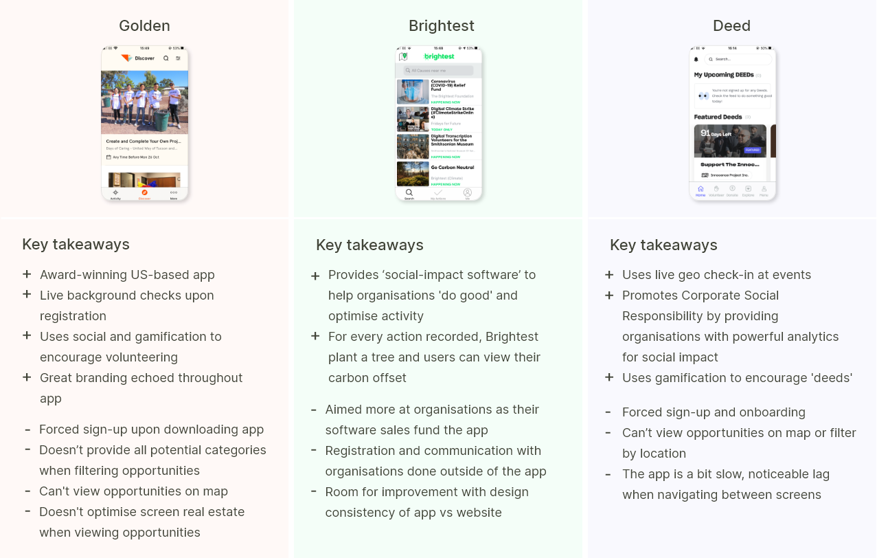
Overall, the competitor apps conveyed volunteering as fun, easy and hassle-free. They did this by providing a simple means of finding and registering for opportunities, through a filterable search function, live background checks and live geo check-ins.
The main areas of improvements I identified concerned more personalised filter options, better use of screen real estate when browsing for opportunities, and the use of foot-in-the-door sign-up, as opposed to a forced sign-up.
User research
To gain a better understanding of the problem space from the perspective of volunteer users, I conducted three semi-structured interviews with individuals who:
a) were open to volunteering or had considered volunteering before, and/or
b) were currently volunteering or had volunteered regularly in the past
I sought to test the following hypothesis:
People will perceive volunteering as more accessible and be encouraged to volunteer if opportunities are flexible, easy to find and easy to register for.
The interview questions centred around the interviewees' past volunteering experiences, their attitudes towards and motivations around volunteering, and experiences using digital volunteering products. View full interview schedule here.
Findings
My research synthesis revealed four main themes:
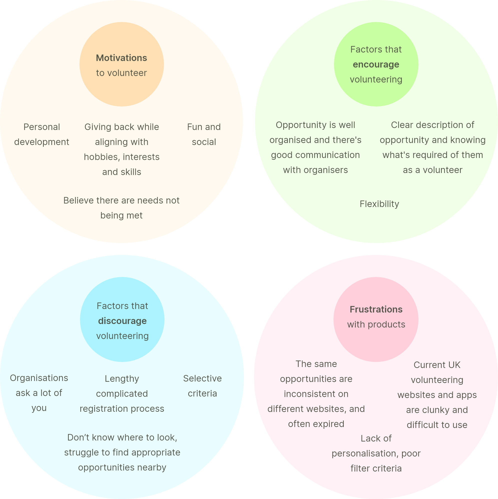
View full results synthesis here.
| “I think one of the main barriers to volunteering is that it’s quite difficult to find something that’s local and for the right amount of time”
On the whole, the findings supported my assumption that people would be encouraged to volunteer if opportunities were flexible, easy to find and easy to register for. More specifically, it seemed that main frustrations surrounded difficulties in finding appropriate opportunities and the cumbersome registration process that often followed. Another important theme that emerged concerned frustrations with current digital products, as all three participants voiced negative experiences around using volunteering apps or websites in the past.
Assumptions challenged
While two interviewees were in favour of submitting personal information for background checks via the app, one was very against it. This challenged my initial assumption that all users would favour quick and easy registrations. I hadn’t considered the possibility that some users may feel uncomfortable with submitting personal information through the app and would rather register outside of the app, even if this meant a longer registration process.
Solution: Provide the option for users to register with organisations directly outside of the app, as well as offering an automatic in-app registration process.
Defining the MVP
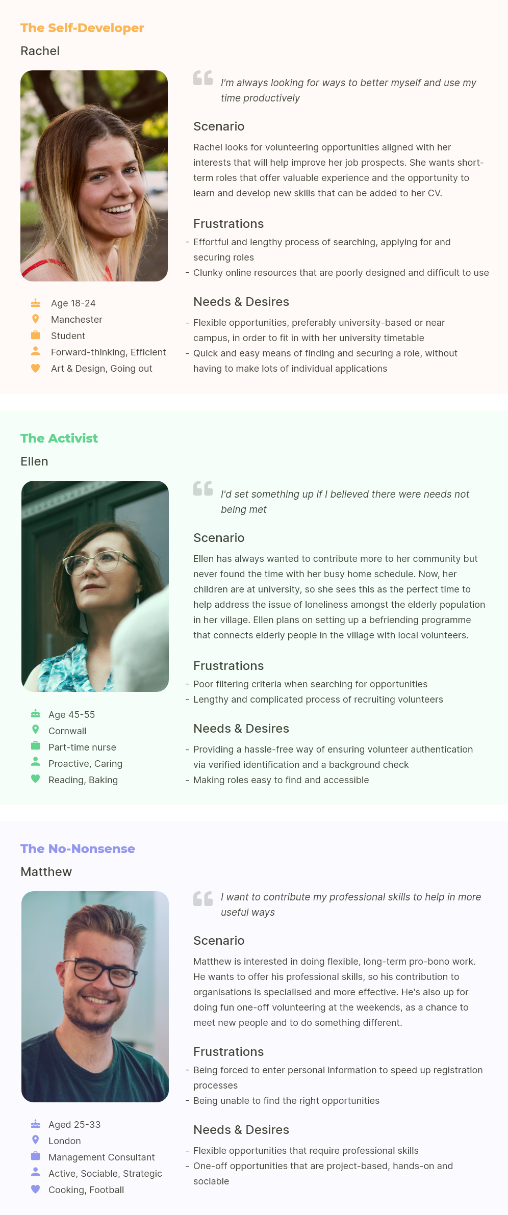
User personas
To help hone-in on the requirements that would be needed for my minimal viable product (MVP), I created three fictional and memorable personas that best represented my interview findings. I used these personas as a tool to help retain my focus on my users' identified goals, needs, desires and frustrations.
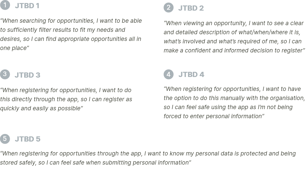
JTBD & User flows
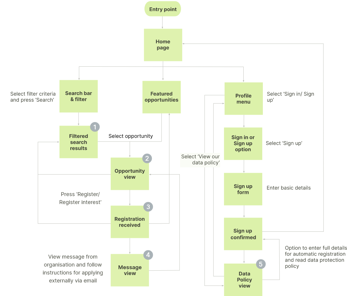
With my personas in mind, I identified Jobs to be Done (JTBD) and their corresponding feature requirements. I distinguished between 'needs' and 'wants' to determine which features would be necessary to include in the MVP. I then mapped out the JTBD into user flows, so I could understand what steps my users would have to take to complete their primary tasks. See breakdown of JTBD and feature requirements here.
User flow diagram
Ideation
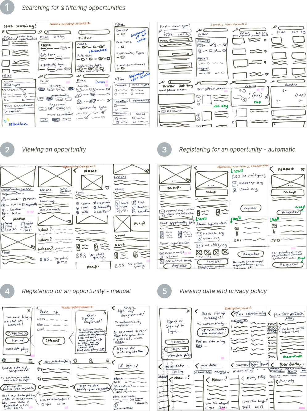
Exploratory sketching
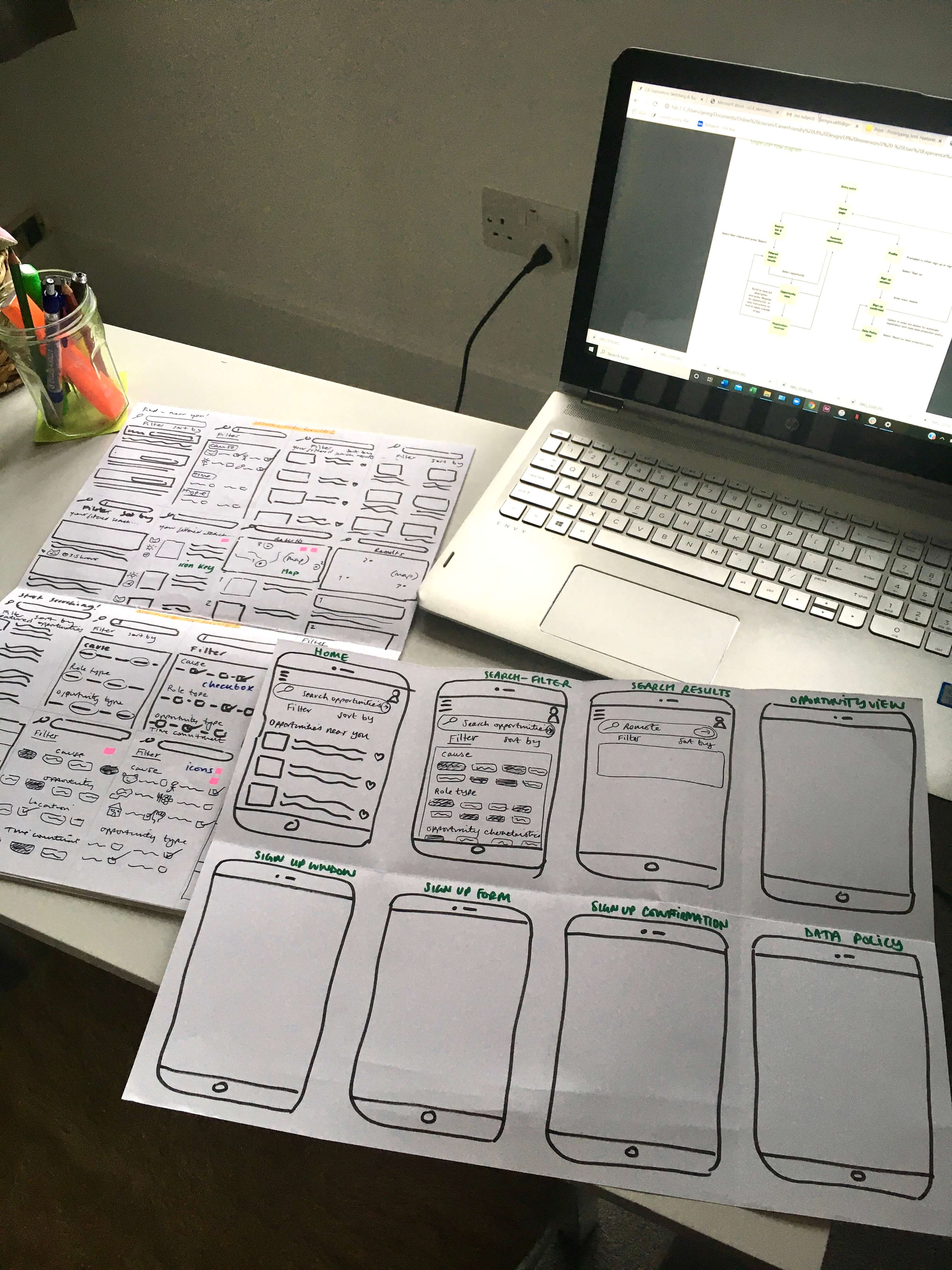
It was time to translate my features and flows into screens. I started by using the Crazy 8s method to sketch out solutions, getting as many ideas down as I could in 8x1 minutes.
I repeated the Crazy 8s process twice for each user flow, which was beneficial as it stopped me from mulling-over ideas before committing to them.
Rapid prototyping
I compiled what I thought were my best sketched solutions into a low-fidelity prototype, along with any other screens necessary to complete my user flows.
Early low-fi prototyping was valuable in helping me realise whether any screens were missing and whether there were any other features I needed to account for.
Validation
Usability testing
It was time to validate my initial designs by testing the usability of the features and flows I had mapped out via the low-fidelity prototype.
I conducted moderated task-based usability testing sessions with three participants in total, two in-person and one via Skype. To ensure the features and flows were faithful to the findings from my interviews, I re-recruited two out of the three participants from the interviews. This also helped me to feel confident that I would be receiving reliable feedback concerning the adequacy of my design solutions. The third participant was new to the problem space, so offered a fresh pair of eyes in identifying any potential new issues.
See full testing schedule and results here.
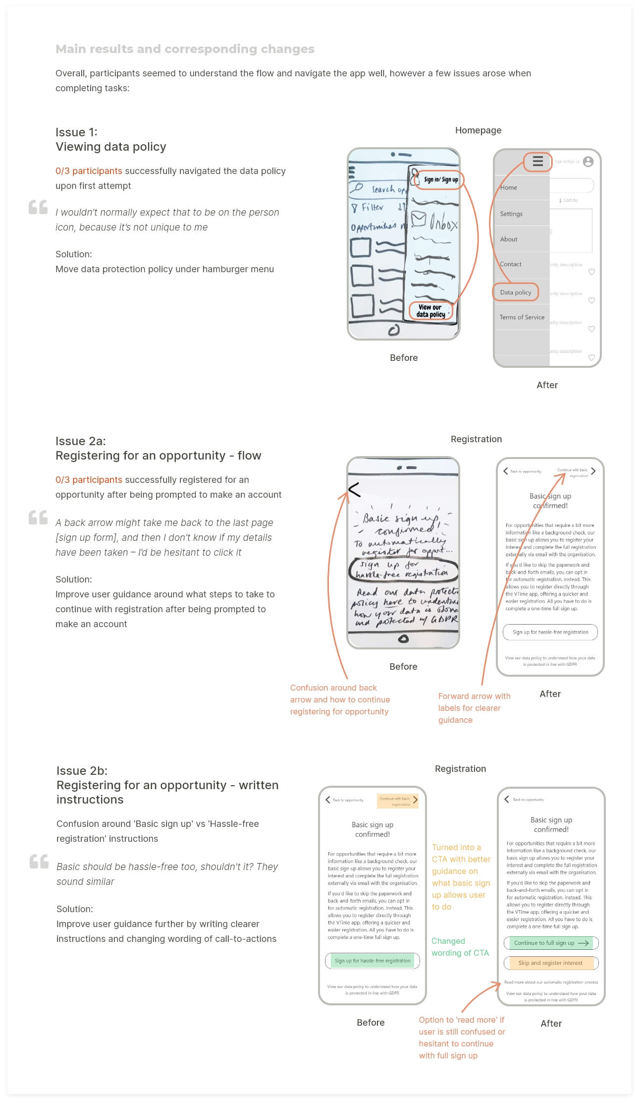
| Fail early and often
Rapid prototyping and testing made me appreciate the importance of the 'Fail early and often' principle of lean UX. I often hesitate when sketching out ideas, worried that I’ll miss out important elements or screens in the process. However, this is the whole point - the Crazy 8s task forced me to generate ideas while leaving out details.
When it came to reviewing my ideas as a paper prototype, the pain points or missing aspects were made more obvious, which sped up the process of knowing what to improve upon. The same could be said for usability testing, as I could see straight away what was working and what wasn't, what ideas I should pursue and what ideas I should abandon, and what new solutions I needed to come up with to address arising problems.
UI DESIGN
Visual direction
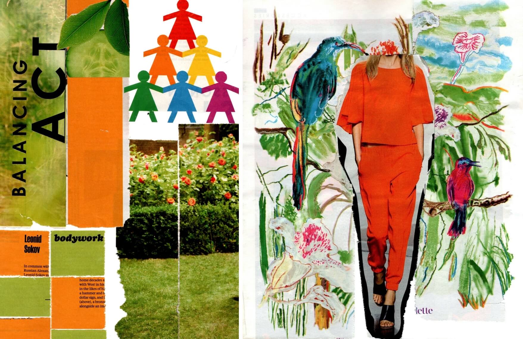
The mood board I developed evoked a bright but modest feel, striking a balance at targeting both younger and older users. Inviting users in with a warm yet fresh colour palette, a soft aesthetic and playful illustrations, it suited the community and 'doing good' feel of volunteering too.
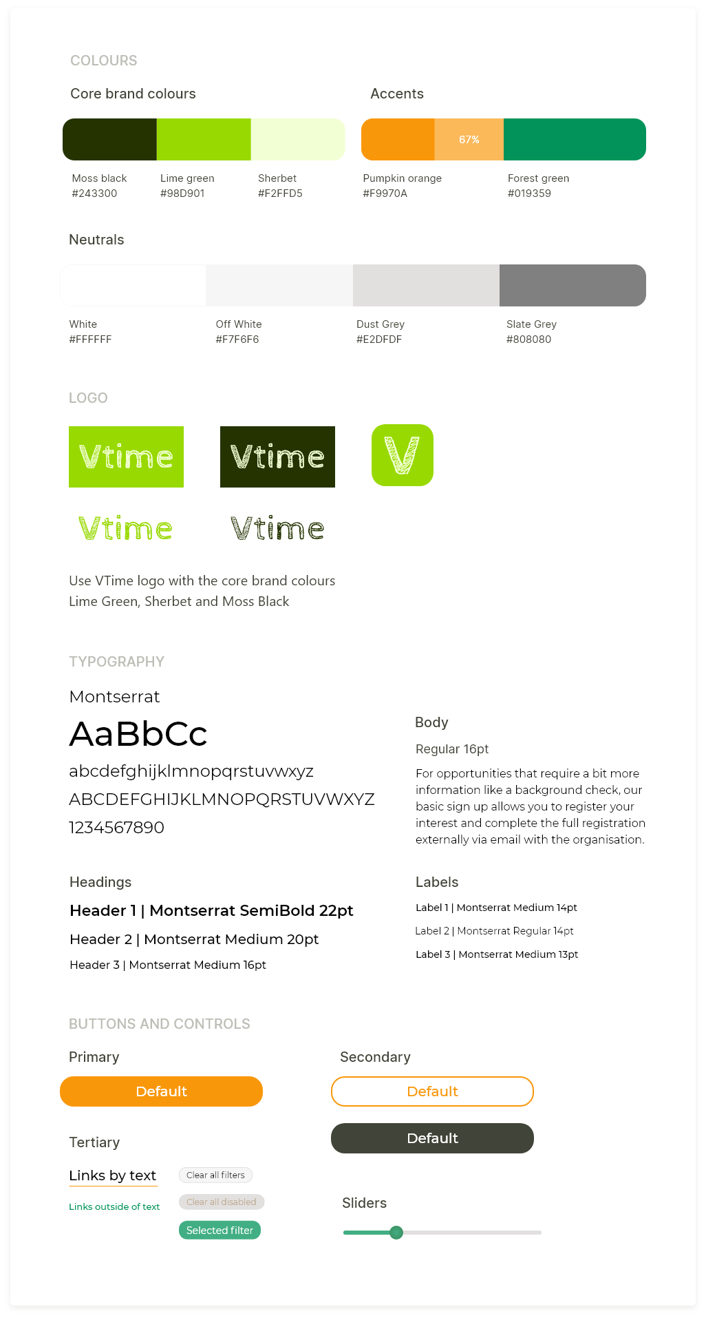
Style guide
FINAL SCREENS
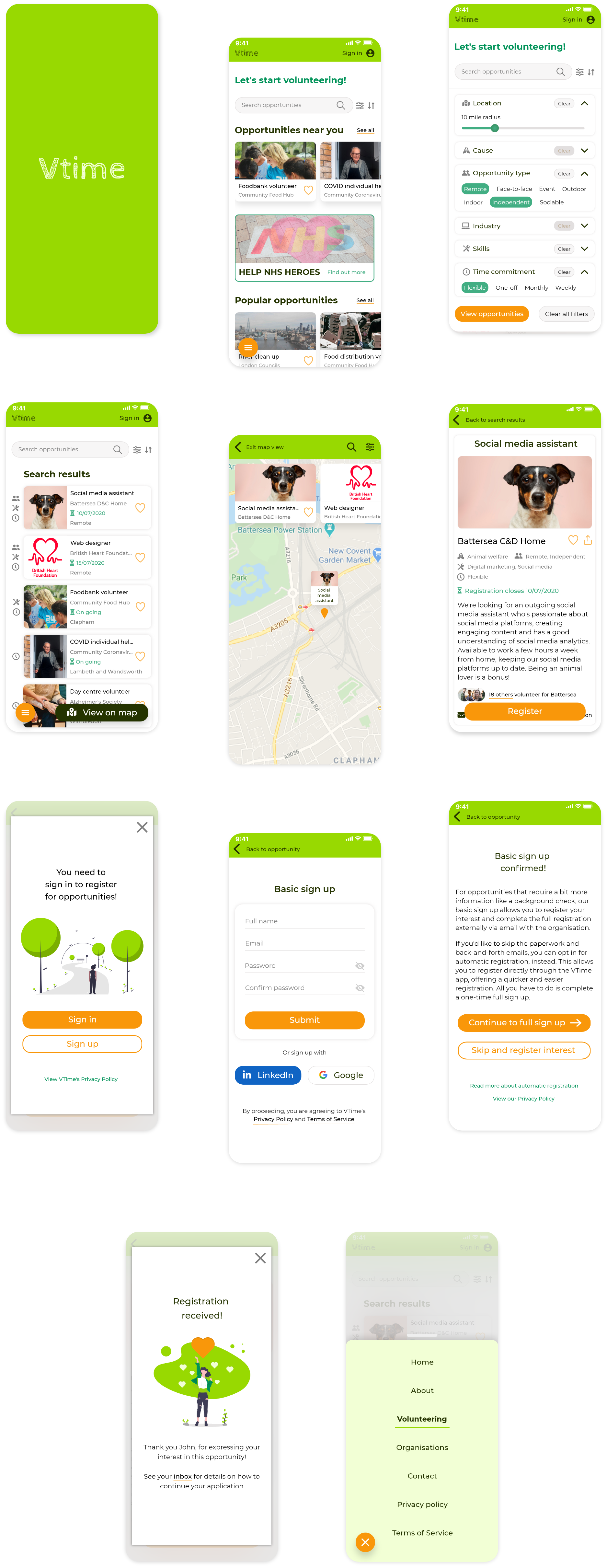
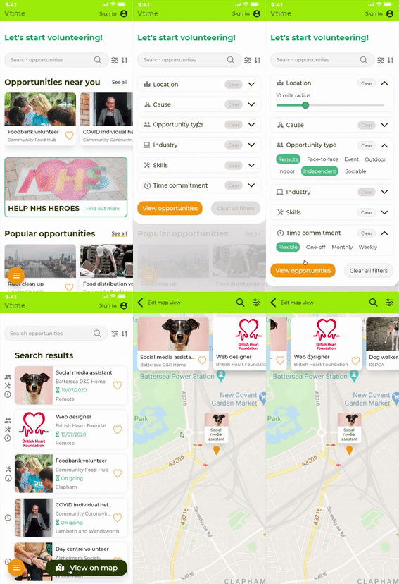
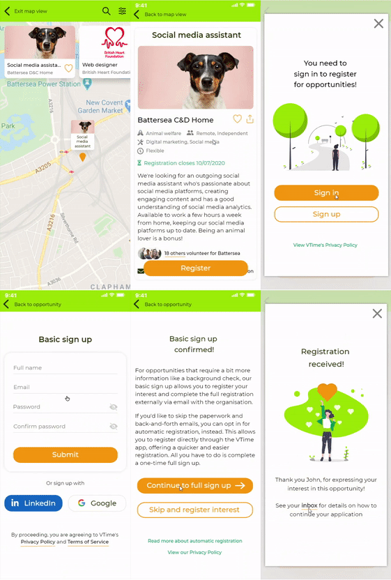
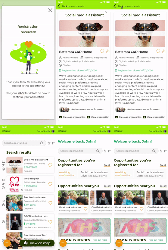
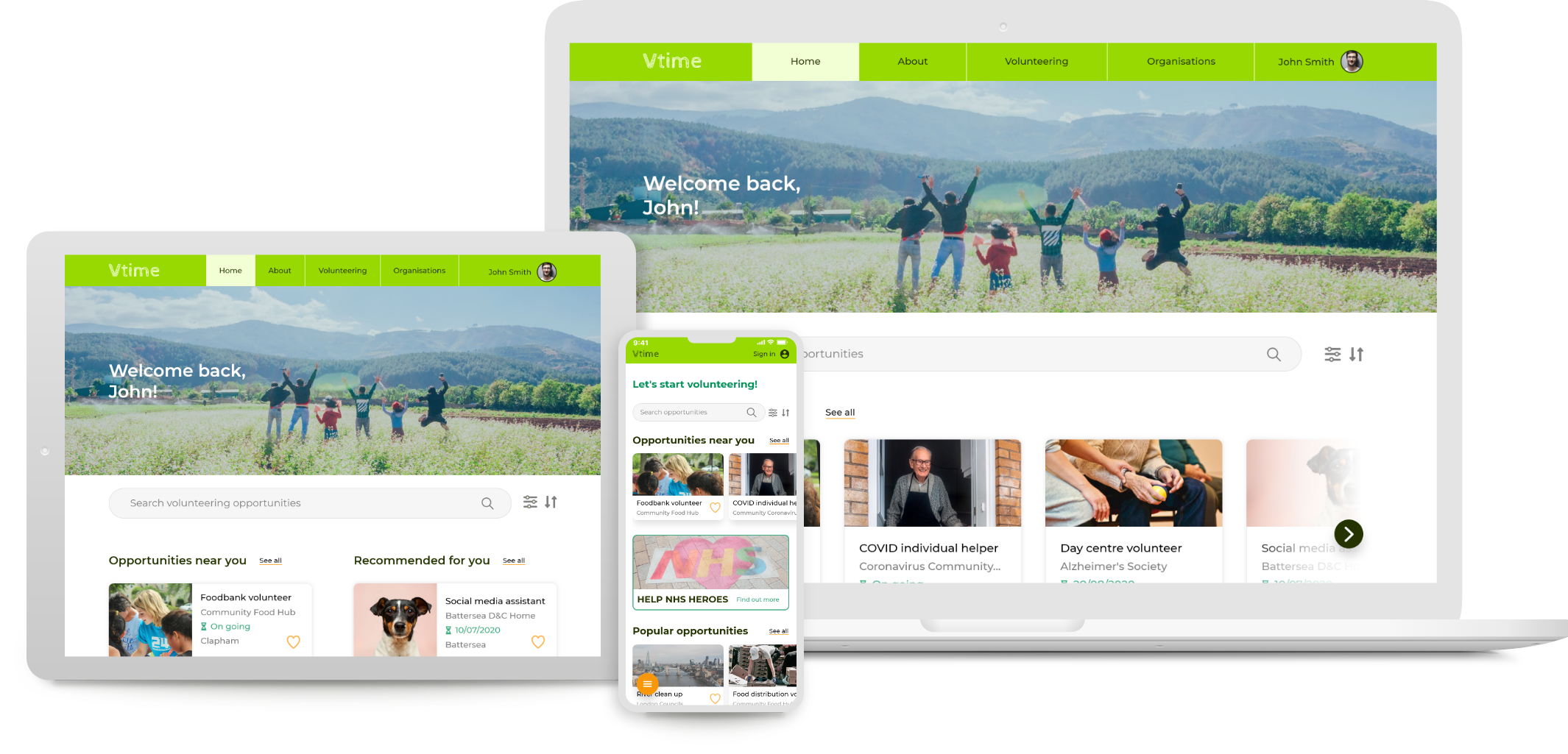
Click to view interactive prototype
REFLECTION
Main learnings
Working within constraints
I underestimated the difficulty of balancing elements with space, while maximising screen real estate. I had a tendency to avoid adding CTA elements, concerned they would add clutter to my screens. However, as discovered from testing and feedback, this came at the expense of users not knowing what they could and couldn't do. I learnt that it's more important to make actions obvious, even if this means adding more elements to a screen. I have to work around potential clutter by allowing for edge cases and adding more space (letting elements 'breathe').
Importance of UX writing
Wording can be interpreted differently by different users, resulting in confusion or misunderstanding. This was something that my usability testing brought to light, highlighting the importance of testing written CTAs and instructions, so that every step is 100% clear for all users.
Improvements going forward
As well as accounting for the above, I noted three areas for improvement during the development of VTime:
Tone down the colour!
Looking back at my final screens, I feel the colour palette is too garish and has poor accessiblity. Using colour successfully will come with a lot of practice but, for now, I should remember to use mostly neutrals with variants of one or two main hues, whilst ensuring the contrast ratio passes AA standards.
Create more accurate test prototypes
I found it difficult knowing how much detail to include in the low fidelity screens, and went with minimum detail involving scribbly text and icons that weren’t completely accurate or legible. This resulted in participants being confused at times, which could have skewed the testing results. In future, I now know to make my low-fi prototypes as clear and representative of the app's basic functions as possible, so as not to interfere with participants’ execution of tasks.
Test more participants
It is widely accepted that approximately 80% of errors can be identified from testing just five users (Nielsen, 2000). Next time, I'll set a minimum target of five participants in the hope of producing more reliable results.
